# View Templates
{% hint style="info" %}
**Version compatibility**
View templates were introduced in version **4.90.0** of the JourneyApps Runtime.
In TypeScript apps, the minimum `runtime-build` version required is **2.4.7**. See the docs [here](https://docs.journeyapps.com/reference/build/syntax/typescript-apps/runtime-build-package) on how to configure this.
{% endhint %}
## Overview
View templates allow developers to define view XML as a standalone template, and reference it across views. What this means for developers:
* Less code duplication across views.
* Easier to maintain complex views, by breaking up the view XML into smaller snippets in templates.
* Can introduce a better separation of concerns - a set of view components can be grouped into distinct templates.
View templates are supported in both JavaScript and TypeScript apps.
## Limitations
* Limited validation and auto-complete in OXIDE.
## Usage & Syntax
Using view templates involves two things:
1. **Defining the template** -> This is done using template definitions (`template.xml` files) for your app.
2. **Referencing it in a view** -> This is done using the `template` UI component on a view.
Let's dive into these:
### 1) Define a view template
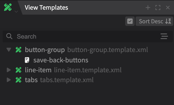
When working with view templates we recommend opening (and docking) the View Templates panel in OXIDE:
Here you can create new templates, view and select existing templates.
You can create multiple template files (e.g. `demo.template.xml`), and each can contain multiple template definitions (``). A template file is simply a way to group similar template definitions.
A template file:
```xml
```
Inside `template-def`, you can define UI components in the similar to how you’d define them in views. You can pass parameters from your views into the template definition, including objects and functions.
```xml
{user.name}
...
```
### 2) Reference the template in a view
In your view XML, reference the view template using the `template` UI component and pass the parameters you defined:
```xml
```
```typescript
// main.ts
async function init() {
view.user = await DB.user.first();
}
function goBack() {
notification.success("Back was pressed");
}
function save() {
notification.success("Save was pressed");
}
```
## Use Cases
### Functions
The below example illustrates how a function can be called in a view template and pass parameters to the view.
Template definition:
```xml
```
View XML:
```xml
```
View TS:
```typescript
// main.ts
function selectItem(selectedItem) {
view.selected_item = selectedItem;
component.dialog({ id: 'select-item-dialog' }).hide();
}
```
### App Modules (TypeScript)
App Modules can be referenced from template definitions directly.
```xml
{user.name}
```
{% hint style="warning" %}
**Warning**
Your app will fail to deploy with a duplicate identifier error if you use the same identifier for an App Module in a view and in a template that is referenced in the view. Ensure that you do not import Modules that are already imported in the underlying view.
{% endhint %}
### Nested templates
You can nest templates by referencing one in a template definition as follows:
```xml
Job number: #{job.number}
```
## Complete Example
The below shows a composable dialog as a view template and demonstrates:
* Passing objects or functions as parameters to the template.
* Using a function expression (inline function)
* Using an app module in a view template.
```xml
```
The corresponding view XML and TS:
```xml
```
```typescript
// main.ts
async function init() {
view.line_item = await DB.line_item.first();
}
function cancel(dialogId:string) {
notification.success("Cancel was pressed");
shared.dialogHelper.close(dialogId);
}
async function save(dialogId:string) {
await view.line_item.save();
notification.success("Save was pressed");
shared.dialogHelper.close(dialogId);
}
```
## Architecture
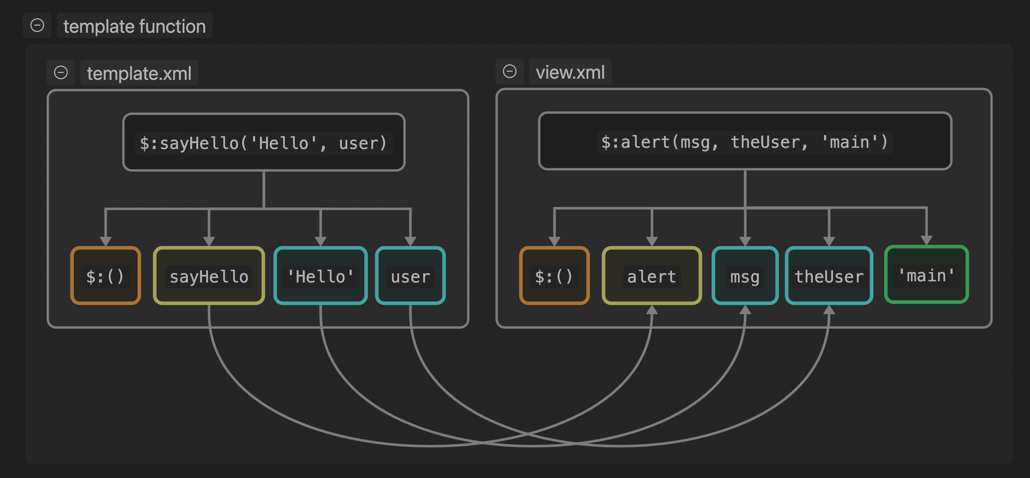
It is important to note that a view `template`, unlike other UI components, does not evaluate expressions, but instead replaces templated components and attributes with the provided values.
Let us use the following example of a `template` with `function` `param`:
Attribute `sayHello` is `$:alert(msg, theUser)` - which is a function call.
```typescript
// example.ts
function alert(msg: string, theUser: DB.user, source?: string) {
notification.info(msg + ' ' + theUser.name);
}
```
```xml
```
The `template-def` declares a `function` parameter with two arguments, `msg` and `theUser`.
When this `template-def` is compiled for the particular view (this happens during a deploy, not at runtime), the expression is broken up into parts and the view's `template` component is replaced with the components inside the `template-def`. Function definitions are replaced as follows:
This results in the `button`’s attribute `on-press="$:alert('Hello', user)"`
Also note that one could still pass view specific arguments, for example `` and only the two matching `arg` values will be replaced, resulting in `on-press="$:alert('Hello', user, 'main')"`
---
# Agent Instructions: Querying This Documentation
If you need additional information that is not directly available in this page, you can query the documentation dynamically by asking a question.
Perform an HTTP GET request on the current page URL with the `ask` query parameter:
```
GET https://docs.journeyapps.com/reference/build/ui-components/view-templates.md?ask=
```
The question should be specific, self-contained, and written in natural language.
The response will contain a direct answer to the question and relevant excerpts and sources from the documentation.
Use this mechanism when the answer is not explicitly present in the current page, you need clarification or additional context, or you want to retrieve related documentation sections.