# time-input
## Overview
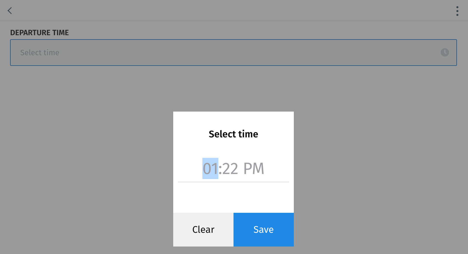
`time-input` allows users to enter a time (bound to a [`datetime`](https://docs.journeyapps.com/reference/data-model-configuration/model/field#date-and-time-datetime) field) using a time picker.
{% hint style="info" %}
**Version compatibility**
`time-input` was introduced in version **4.87.0** of the JourneyApps Runtime.
{% endhint %}
### Basic Example
{% code title="main.view\.xml" %}
```xml
```
{% endcode %}

## Standard Attributes
### `bind`
{% content-ref url="../xml-fields/bind" %}
[bind](https://docs.journeyapps.com/reference/build/ui-components/xml-fields/bind)
{% endcontent-ref %}
### `label`
{% content-ref url="../xml-fields/label" %}
[label](https://docs.journeyapps.com/reference/build/ui-components/xml-fields/label)
{% endcontent-ref %}
### `required`
{% content-ref url="../xml-fields/required" %}
[required](https://docs.journeyapps.com/reference/build/ui-components/xml-fields/required)
{% endcontent-ref %}
## Advanced Attributes
### `align-content`
{% content-ref url="../xml-fields/align-content" %}
[align-content](https://docs.journeyapps.com/reference/build/ui-components/xml-fields/align-content)
{% endcontent-ref %}
### `align-label`
{% content-ref url="../xml-fields/align-label" %}
[align-label](https://docs.journeyapps.com/reference/build/ui-components/xml-fields/align-label)
{% endcontent-ref %}
### `clear-button-visibility`
{% content-ref url="../xml-fields/clear-button-visibility" %}
[clear-button-visibility](https://docs.journeyapps.com/reference/build/ui-components/xml-fields/clear-button-visibility)
{% endcontent-ref %}
### `clear-icon`
**Optional**
**Type**: `string`
**Default**: "fa-times"
Specify the icon on the right side of the input that appears when a time was selected. Find a list of available icons [here](https://docs.journeyapps.com/reference/build/ui-components/all-ui-components/icons).
### `disabled`
{% content-ref url="../xml-fields/disabled" %}
[disabled](https://docs.journeyapps.com/reference/build/ui-components/xml-fields/disabled)
{% endcontent-ref %}
### `error-message`
{% content-ref url="../xml-fields/error-message" %}
[error-message](https://docs.journeyapps.com/reference/build/ui-components/xml-fields/error-message)
{% endcontent-ref %}
### `icon-position`
{% content-ref url="../xml-fields/icon-position" %}
[icon-position](https://docs.journeyapps.com/reference/build/ui-components/xml-fields/icon-position)
{% endcontent-ref %}
### `id`
{% content-ref url="../xml-fields/id" %}
[id](https://docs.journeyapps.com/reference/build/ui-components/xml-fields/id)
{% endcontent-ref %}
### `label-case`
{% content-ref url="../xml-fields/label-case" %}
[label-case](https://docs.journeyapps.com/reference/build/ui-components/xml-fields/label-case)
{% endcontent-ref %}
### `label-color`
{% content-ref url="../xml-fields/label-color" %}
[label-color](https://docs.journeyapps.com/reference/build/ui-components/xml-fields/label-color)
{% endcontent-ref %}
### `modifier-text`
{% content-ref url="../xml-fields/modifier-text" %}
[modifier-text](https://docs.journeyapps.com/reference/build/ui-components/xml-fields/modifier-text)
{% endcontent-ref %}
### `on-change`
{% content-ref url="../xml-fields/on-change" %}
[on-change](https://docs.journeyapps.com/reference/build/ui-components/xml-fields/on-change)
{% endcontent-ref %}
### `placeholder`
{% content-ref url="../xml-fields/placeholder" %}
[placeholder](https://docs.journeyapps.com/reference/build/ui-components/xml-fields/placeholder)
{% endcontent-ref %}
### `show-if` and `hide-if`
{% content-ref url="../xml-fields/show-if" %}
[show-if](https://docs.journeyapps.com/reference/build/ui-components/xml-fields/show-if)
{% endcontent-ref %}
{% content-ref url="../xml-fields/hide-if" %}
[hide-if](https://docs.journeyapps.com/reference/build/ui-components/xml-fields/hide-if)
{% endcontent-ref %}
### `time-format`
**Optional**
**Type:** `12h` | `24h`
**Default**: `12h`
Specify the clock format when users enter a time. Example:
* `12h` format: **3:32 PM**
* `24h` format: **15:32**
### `time-icon`
**Optional**
**Type**: `string`
**Default**: "fa-clock"
Specify the icon on the right side of the input that appears before a time was selected. Find a list of available icons [here](https://docs.journeyapps.com/reference/build/ui-components/all-ui-components/icons).
## Component Methods
The following component methods are available when an [`id`](https://docs.journeyapps.com/reference/build/ui-components/xml-fields/id) is assigned to the component and `component.timeInput({id:'my-id'})` is called from JS/TS:
### `clear`
Programmatically clear the selected date and time bound to the `time-input` component.
### `pickTime`
Programmatically open the time picker to allow the user to select or update a time value.
### `scrollIntoView`
Programmatically scroll until the `time-input` is visible in the view.