# toggle
## Overview
`toggle` is an input component with a binary state, which allows users to easily switch between the two states.
{% hint style="info" %}
**Version compatibility**
`toggle` was introduced in version **4.36.1** of the JourneyApps Runtime.
{% endhint %}
### Basic Example
{% code title="main.view\.xml" %}
```xml
```
{% endcode %}

## Standard Attributes
### `bind`
{% content-ref url="../xml-fields/bind" %}
[bind](https://docs.journeyapps.com/reference/build/ui-components/xml-fields/bind)
{% endcontent-ref %}
### `label`
{% content-ref url="../xml-fields/label" %}
[label](https://docs.journeyapps.com/reference/build/ui-components/xml-fields/label)
{% endcontent-ref %}
### `required`
{% content-ref url="../xml-fields/required" %}
[required](https://docs.journeyapps.com/reference/build/ui-components/xml-fields/required)
{% endcontent-ref %}
{% hint style="info" %}
Unlike the standard `require` behavior, setting `` to required will force the user to enable it (Or check it if the [mode](#mode) attribute is set to "checkbox")
This behavior was introduced in version **5.0.1** of the JourneyApps Runtime.
{% endhint %}
## Advanced Attributes
### `align-content`
{% content-ref url="../xml-fields/align-content" %}
[align-content](https://docs.journeyapps.com/reference/build/ui-components/xml-fields/align-content)
{% endcontent-ref %}
### `align-label`
{% content-ref url="../xml-fields/align-label" %}
[align-label](https://docs.journeyapps.com/reference/build/ui-components/xml-fields/align-label)
{% endcontent-ref %}
### `disabled`
{% content-ref url="../xml-fields/disabled" %}
[disabled](https://docs.journeyapps.com/reference/build/ui-components/xml-fields/disabled)
{% endcontent-ref %}
### `id`
{% content-ref url="../xml-fields/id" %}
[id](https://docs.journeyapps.com/reference/build/ui-components/xml-fields/id)
{% endcontent-ref %}
### `label-case`
{% hint style="info" %}
**Version compatibility**
`label-case` was introduced in version **4.80.0** of the JourneyApps Runtime.
{% endhint %}
{% content-ref url="../xml-fields/label-case" %}
[label-case](https://docs.journeyapps.com/reference/build/ui-components/xml-fields/label-case)
{% endcontent-ref %}
### `label-color`
{% content-ref url="../xml-fields/label-color" %}
[label-color](https://docs.journeyapps.com/reference/build/ui-components/xml-fields/label-color)
{% endcontent-ref %}
### `mode`
**Optional**
**Type**: `toggle` | `radio` | `checkbox`
**Default**: `toggle`
{% hint style="info" %}
**Version compatibility**
`mode` was introduced in version **4.84.0** of the JourneyApps Runtime.
{% endhint %}
Specify whether the boolean value should be displayed as a toggle, radio, or checkbox.
### `on-change`
{% content-ref url="../xml-fields/on-change" %}
[on-change](https://docs.journeyapps.com/reference/build/ui-components/xml-fields/on-change)
{% endcontent-ref %}
### `show-if` and `hide-if`
{% content-ref url="../xml-fields/show-if" %}
[show-if](https://docs.journeyapps.com/reference/build/ui-components/xml-fields/show-if)
{% endcontent-ref %}
{% content-ref url="../xml-fields/hide-if" %}
[hide-if](https://docs.journeyapps.com/reference/build/ui-components/xml-fields/hide-if)
{% endcontent-ref %}
### `status-disabled`
**Optional**
**Type**: `string` (static text, a [format string](https://docs.journeyapps.com/reference/app-features/xml-format-strings) or the return value of a [JS/TS function](https://docs.journeyapps.com/reference/app-features/calling-js-functions-from-xml))
**Default**: unset
Text displayed to the right of the `toggle` when it is disabled.
### `status-false`
**Optional**
**Type**: `string` (static text, a [format string](https://docs.journeyapps.com/reference/app-features/xml-format-strings) or the return value of a [JS/TS function](https://docs.journeyapps.com/reference/app-features/calling-js-functions-from-xml))
**Default**: unset
Text displayed to the right of the `toggle` when it is bound to a `false` state.
{% code title="main.view\.xml" %}
```xml
```
{% endcode %}

### `status-true`
**Optional**
**Type**: `string` (static text, a [format string](https://docs.journeyapps.com/reference/app-features/xml-format-strings) or the return value of a [JS/TS function](https://docs.journeyapps.com/reference/app-features/calling-js-functions-from-xml))
**Default**: unset
Text displayed to the right of the `toggle` when it is bound to a `true` state.
{% code title="main.view\.xml" %}
```xml
```
{% endcode %}

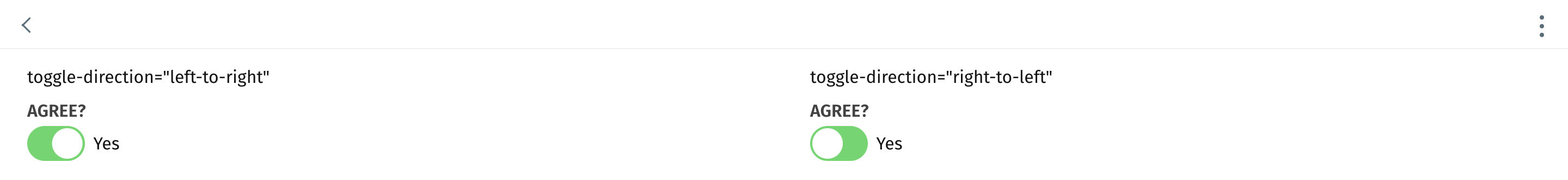
### `toggle-direction`
{% hint style="info" %}
**Version compatibility**
`toggle-direction` was introduced in version **4.86.1** of the JourneyApps Runtime.
{% endhint %}
**Optional**
**Type**: `left-to-right` | `right-to-left`
**Default**: `left-to-right`
Specify in which direction the toggle widget moves when activated.
{% code title="main.view\.xml" %}
```xml
toggle-direction="left-to-right"toggle-direction="right-to-left"
```
{% endcode %}
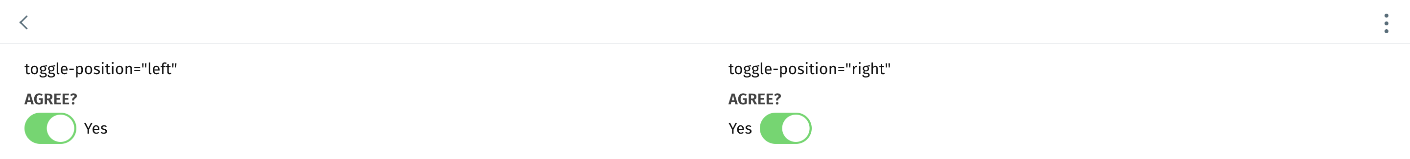
### `toggle-position`
{% hint style="info" %}
**Version compatibility**
`toggle-position` was introduced in version **4.86.1** of the JourneyApps Runtime.
{% endhint %}
**Optional**
**Type**: `left` | `right`
**Default**: `left`
Specify where the toggle button is positioned in the component (relative to the status text).
{% code title="main.view\.xml" %}
```xml
toggle-position="left"toggle-position="right"
```
{% endcode %}
## Component Methods
The following component methods are available when an [`id`](https://docs.journeyapps.com/reference/build/ui-components/xml-fields/id) is assigned to the component and `component.textInput({id:'my-id'}).xxx` is called from JS/TS:
### `scrollIntoView`
Programmatically scroll until the `toggle` component is visible in the view.
### `setState`
Programmatically set the state of the `boolean` bound to the `toggle` component.
```javascript
component.toggle({id: 'my-id'}).setState(true);
```
### `toggleState`
Programmatically toggle the state of the `boolean` bound to the `toggle` component. A `false` or `null` state will toggle to `true`, and a `true` state will toggle to `false`.
```javascript
component.toggle({id: 'my-id'}).toggleState();
```