# columns
## Overview
`columns` allow developers to control the layout of a view and its components, which is particularly useful for medium and large screens.
{% hint style="info" %}
On screens narrower than the 768px breakpoint value (i.e. smartphones as opposed to tablets), columns will be stacked — the components inside of them are rendered below each other as if they were not defined in columns.
{% endhint %}
### Multiple columns
Columns now support multiple nested columns which enables use cases like the following:

### Basic Example
{% code title="main.view\.xml" %}
```xml
Column 1Column 2Column 3
```
{% endcode %}

## Standard Attributes
None
## Advanced Attributes
### `column-gap`
{% hint style="info" %}
**Version compatibility**
`column-gap` was introduced in version **4.86.1** of the JourneyApps Runtime.
{% endhint %}
**Optional**
**Type**: `number` (a values in px)
**Default**: 48 px
Specify the width of the gap between columns.
{% code title="main.view\.xml" %}
```xml
default column-gapColumn 1Column 2Column 3column-gap="80"Column 1Column 2Column 3
```
{% endcode %}
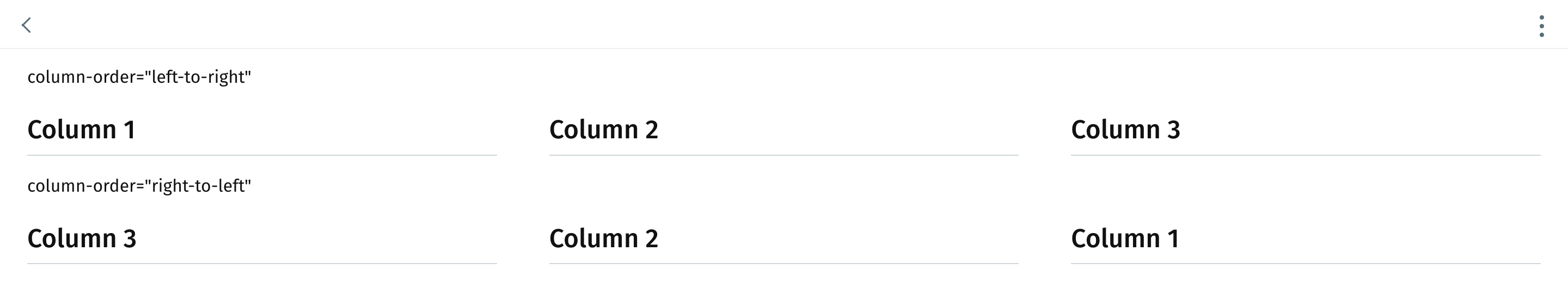
### `column-order`
{% hint style="info" %}
**Version compatibility**
`column-order` was introduced in version **4.86.1** of the JourneyApps Runtime.
{% endhint %}
**Optional**
**Type**: `left-to-right`| `right-to-left`
**Default**: `left-to-right`
Specify the order of the columns.
{% code title="main.view\.xml" %}
```xml
column-order="left-to-right"Column 1Column 2Column 3column-order="right-to-left"Column 1Column 2Column 3
```
{% endcode %}
### `show-if` and `hide-if`
{% content-ref url="../xml-fields/show-if" %}
[show-if](https://docs.journeyapps.com/reference/build/ui-components/xml-fields/show-if)
{% endcontent-ref %}
{% content-ref url="../xml-fields/hide-if" %}
[hide-if](https://docs.journeyapps.com/reference/build/ui-components/xml-fields/hide-if)
{% endcontent-ref %}
---
# Agent Instructions: Querying This Documentation
If you need additional information that is not directly available in this page, you can query the documentation dynamically by asking a question.
Perform an HTTP GET request on the current page URL with the `ask` query parameter:
```
GET https://docs.journeyapps.com/reference/build/ui-components/all-ui-components/columns.md?ask=
```
The question should be specific, self-contained, and written in natural language.
The response will contain a direct answer to the question and relevant excerpts and sources from the documentation.
Use this mechanism when the answer is not explicitly present in the current page, you need clarification or additional context, or you want to retrieve related documentation sections.