# button-group
## Overview
`button-group` allows for grouping of multiple [`button`](https://docs.journeyapps.com/reference/build/ui-components/all-ui-components/button) components, providing better control over layout and visibility.
{% hint style="info" %}
**Version Compatibility**
`button-group` v3 with support for floating action buttons were introduced in version **4.70.0** of the JourneyApps Runtime.
{% endhint %}
For more information on `button`, please see the linked documentation:
{% content-ref url="button" %}
[button](https://docs.journeyapps.com/reference/build/ui-components/all-ui-components/button)
{% endcontent-ref %}
### Basic Example
```xml
```

## Standard Attributes
None
## Advanced Attributes
### `align-content`
Specify the alignment of button content for all buttons in the `button-group`. See more info about `align-content`:
{% content-ref url="../xml-fields/align-content" %}
[align-content](https://docs.journeyapps.com/reference/build/ui-components/xml-fields/align-content)
{% endcontent-ref %}
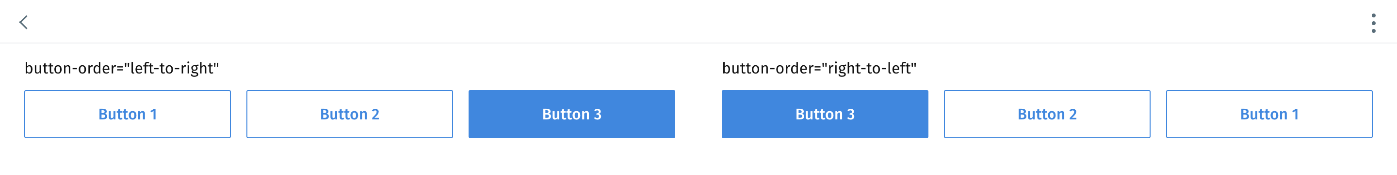
### `button-order`
{% hint style="info" %}
**Version compatibility**
`button-order` was introduced in version **4.86.1** of the JourneyApps Runtime.
{% endhint %}
**Optional**
**Type**: `left-to-right`|`right-to-left`
**Default**: `left-to-right`
Specify the order of buttons when the `button-group` [`mode`](#mode) is set to `row`.
### `color`
**Optional**
**Type**: `string` - can be a named color or #HEX value
**Default**: unset
Specify the [`color`](https://docs.journeyapps.com/reference/build/ui-components/button#color) for all buttons in the `button-group`.
### `disabled`
**Optional**
**Type**: `boolean`
**Default**: `false`
Disables all buttons in the `button-group` to prevent a user from firing their actions.
#### Example: Disabled buttons
```xml
```
### `id`
{% content-ref url="../xml-fields/id" %}
[id](https://docs.journeyapps.com/reference/build/ui-components/xml-fields/id)
{% endcontent-ref %}
### `icon`
**Optional**
**Type**: `string`
**Default**: unset
{% hint style="info" %}
This attribute is only available with `type="floating".`
{% endhint %}
The icon of the main button when using a floating action button group.
### `icon-color`
**Optional**
**Type**: `string` - can be a named color or #HEX value
**Default**: unset
Specify the [`icon-color`](https://docs.journeyapps.com/reference/build/ui-components/button#icon-color) for all buttons in the `button-group`.
### `icon-position`
Specify the position of button icons for all buttons in the `button-group`. See more info about `icon-position`:
{% content-ref url="../xml-fields/icon-position" %}
[icon-position](https://docs.journeyapps.com/reference/build/ui-components/xml-fields/icon-position)
{% endcontent-ref %}
### `label-case`
Configure the letter case of the `label` for all buttons in the `button-group`. See more info about `label-case`:
{% content-ref url="../xml-fields/label-case" %}
[label-case](https://docs.journeyapps.com/reference/build/ui-components/xml-fields/label-case)
{% endcontent-ref %}
### `min-width-breakpoint`
**Optional**
**Type**: `integer`
**Default**: `550 px`
{% hint style="info" %}
**Version compatibility**
`min-width-breakpoint` was introduced in version **4.84.1** of the JourneyApps Runtime.
{% endhint %}
Override at what point `button-group` changes from a row (aligned horizontally) into a column (aligned vertically) layout. The value (in pixel) refers to the minimum width of the screen, at which point the `button-group` should change its layout.
**Example:** Default (550 px):
```xml
```
On a large screen:

On a small screen:

**Example:** Where `min-width-breakpoint` is reduced 200 px:
```xml
```
On a large screen:

On a small screen:

### `mode`
**Optional**
**Type**: `row` | `column` | `split` | `collapsed`
**Default**: `row`
Control the layout of buttons with a button group.
{% hint style="info" %}
A `button-group` in `mode="row"` will switch to `mode="column"` on devices with smaller screens.
{% endhint %}
#### Examples: Button group modes
**Mode: `row`**
```xml
```

**Mode: `column`**
```xml
```

**Mode: `split`**
When using `split` mode, the first button is kept full, the rest of the buttons are converted to an action sheet, represented by an icon-only button that matches the style of the first button.
```xml
```

**Mode: `collapsed`**
Collapsed button-groups transforms all buttons to a single button that opens an Action Sheet when selected.
```xml
```


### `show-if` and `hide-if`
{% content-ref url="../xml-fields/show-if" %}
[show-if](https://docs.journeyapps.com/reference/build/ui-components/xml-fields/show-if)
{% endcontent-ref %}
{% content-ref url="../xml-fields/hide-if" %}
[hide-if](https://docs.journeyapps.com/reference/build/ui-components/xml-fields/hide-if)
{% endcontent-ref %}
**Note**: A `button-group` will also be hidden when it contains no visible buttons.
### `style`
**Optional**
**Type**: `solid` | `outline`
**Default**: `solid`
Set the [`style`](https://docs.journeyapps.com/reference/build/ui-components/button#style) of all buttons in the `button-group`.
### `type`
**Optional**
**Type**: `normal` | `primary` | `floating`
**Default**: `normal`
Specify the type of `button-group`, in most cases the default will suffice.
Both special case types, i.e. `primary` | `floating` have different behaviors and constraints.
#### Examples: Button group types
**Type: `primary`**
Pin a button group at the bottom of the view
{% hint style="warning" %}
Only one `button-group` with `type="primary"` is allowed per view.
{% endhint %}
```xml
```

**Type: `floating`**
Add a floating action button (FAB) or button group to view. Different to `type="primary"`, this FABs are pinned to the bottom right corner of the screen
{% hint style="warning" %}
Only one `button-group` with `type="floating"` is allowed per view.
{% endhint %}
**Single floating button**
```xml
```

**Floating button group**
```xml
```

Select the button to open the floating action button group:

## Component Methods
The following component methods are available when an [`id`](https://docs.journeyapps.com/reference/build/ui-components/xml-fields/id) is assigned to the component and `component.buttonGroup({id:'my-id'})` is called from JS/TS:
### `scrollIntoView`
Programmatically scroll until the `button-group` is visible in the view.